


Elements
Button with Wave
05 Oct 2022
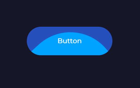
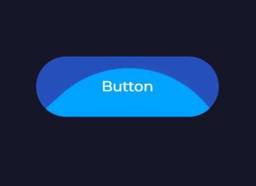
Анімована кнопка з появою елемента у вигляді хвилі при ховері
HTML
SCSS
PostCSS
<a href="#" class="btn"><span>Button</span></a>
                            .btn {
  position: relative;
  overflow: hidden;

  display: flex;
  align-items: center;
  justify-content: center;

  min-width: 150px;
  height: 50px;
  width: fit-content;

  font-size: ac(15px, 12px);
  border-radius: 25px;

  background: #2650bc;

  // For Safari overflow
  -webkit-backface-visibility: hidden;
  -moz-backface-visibility: hidden;
  -webkit-transform: translate3d(0, 0, 0);
  -moz-transform: translate3d(0, 0, 0);

  span {
    z-index: 5;
    position: relative;
    pointer-events: none;
  }

  &::after {
    position: absolute;
    content: "";
    top: 140%;
    left: 50%;
    width: 200px;
    height: 200px;
    background: #00a2ff;
    margin-left: -100px;
    border-radius: 42%;
    transform-origin: 50% 50%;
    transition: top 0.6s ease-in-out;
  }

  &:hover {
    &::after {
      top: 30%;
      animation: wave-btn 2s infinite linear;
    }
  }

  &:active {
    &::after {
      top: -100%;
    }
  }

  @include xxl {
    font-size: 18px;
    min-width: 185px;
  }
}

/* Animation */
@keyframes wave-btn {
  0% {
    transform: rotate(0deg) scale(1);
  }

  50% {
    transform: rotate(180deg) scale(0.975);
  }

  100% {
    transform: rotate(360deg) scale(1);
  }
}
                            /* For Safari overflow */
@define-mixin safari-overflow {
  -webkit-backface-visibility: hidden;
  -moz-backface-visibility: hidden;
  -webkit-transform: translate3d(0, 0, 0);
  -moz-transform: translate3d(0, 0, 0);
}

.btn {
  position: relative;
  overflow: hidden;

  display: flex;
  align-items: center;
  justify-content: center;

  min-width: 150px;
  height: 50px;
  width: fit-content;

  font-size: ac(15px, 12px);
  border-radius: 25px;

  background: #2650bc;

  @mixin safari-overflow;

  span {
    z-index: 5;
    position: relative;
    pointer-events: none;
  }

  &::after {
    position: absolute;
    content: "";
    top: 140%;
    left: 50%;
    width: 200px;
    height: 200px;
    background: #00a2ff;
    margin-left: -100px;
    border-radius: 42%;
    transform-origin: 50% 50%;
    transition: top 0.6s ease-in-out;
  }

  &:hover {
    &::after {
      top: 30%;
      animation: wave-btn 2s infinite linear;
    }
  }

  &:active {
    &::after {
      top: -100%;
    }
  }

  @mixin desk-xl {
    font-size: 18px;
    min-width: 185px;
  }
}

/* Animation */

@keyframes wave-btn {
  0% {
    transform: rotate(0deg) scale(1);
  }

  50% {
    transform: rotate(180deg) scale(0.975);
  }

  100% {
    transform: rotate(360deg) scale(1);
  }
}