


Forms
Contact Us with Map
19 Sep 2022
Contact us with map
HTML
SCSS
PostCSS
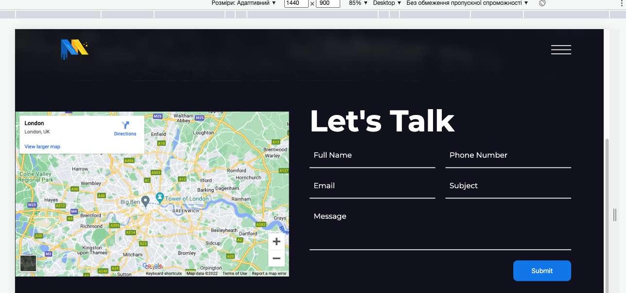
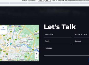
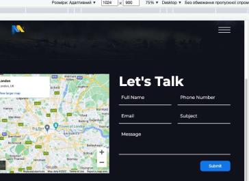
<section class="contact-us">
<div class="cont">
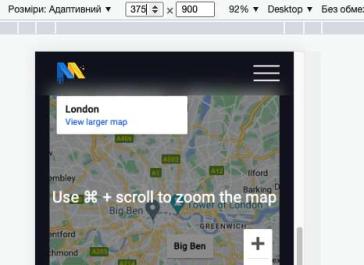
<!-- Map -->
<div class="map">
<iframe
src="https://www.google.com/maps/embed?pb=!1m18!1m12!1m3!1d158858.47340002653!2d-0.24168120642536509!3d51.52855824164916!2m3!1f0!2f0!3f0!3m2!1i1024!2i768!4f13.1!3m3!1m2!1s0x47d8a00baf21de75%3A0x52963a5addd52a99!2z0JvQvtC90LTQvtC9LCDQktC10LvQuNC60L7QsdGA0LjRgtCw0L3QuNGP!5e0!3m2!1sru!2sua!4v1655458142532!5m2!1sen!2sua"
width="600"
height="450"
style="border: 0"
allowfullscreen=""
loading="lazy"
referrerpolicy="no-referrer-when-downgrade"
></iframe>
</div>
<!-- Default Form -->
<div class="map-form">
<h1>Let's Talk</h1>
<form action="">
<input type="text" placeholder="Full Name" />
<input type="text" placeholder="Phone Number" />
<input type="email" placeholder="Email" />
<input type="text" placeholder="Subject" />
<textarea placeholder="Message"></textarea>
<button type="submit" class="btn">Submit</button>
</form>
</div>
</div>
</section>
.contact-us {
padding: 50px 0;
.cont {
display: flex;
align-items: center;
flex-direction: row;
}
.map {
margin-left: -6.2%;
height: 400px;
flex: 1;
margin-right: ac(50px, 30px);
@media only screen and (min-width: 1441px) {
margin-left: 0;
}
iframe {
height: 100%;
}
}
.map-form {
width: 50%;
margin-left: auto;
}
form {
width: 100%;
display: grid;
row-gap: 25px;
column-gap: 25px;
grid-template-columns: 1fr 1fr;
.btn {
grid-column: 2;
justify-self: flex-end;
}
input, textarea {
background-color: transparent;
border-bottom: 2px solid #fff;
border-bottom: 2px solid var(--white);
border-radius: 0;
color: #fff;
font-family: var(--font-main);
font-size: 18px;
padding: 5px 10px 15px;
position: relative;
resize: none;
transition: all .3s ease-in-out;
width: 100%;
&::placeholder {
color: inherit;
}
}
}
}
.map {
width: 100%;
iframe {
width: 100%;
height: 400px;
}
}
/* Default Form */
.map-form {
textarea {
grid-column: 1 / -1;
}
}
@include media(1025) {
.map-form {
textarea {
grid-column: 1 / -1;
}
.btn {
grid-column: 2;
}
}
}
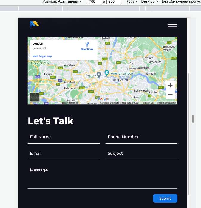
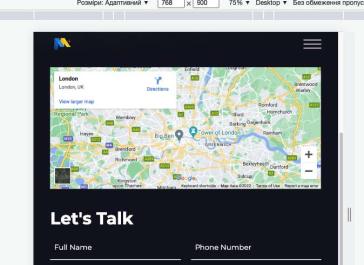
@include media(992) {
.contact-us {
.cont {
flex-direction: column;
}
.map {
margin: 0;
width: 100%;
iframe {
height: 300px;
}
}
.map-form {
width: 100%;
margin: 45px 0 0;
}
}
.map-form {
h1 {
@include media(1025) {
margin-bottom: 25px;
}
}
form {
grid-template-columns: 1fr 1fr;
}
}
}
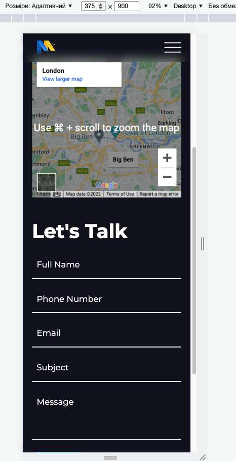
@include media(551) {
.contact-us {
form {
display: flex;
flex-direction: column;
row-gap: 0;
column-gap: 0;
& > * {
margin-bottom: 25px;
}
}
}
.map-form {
textarea {
grid-column: 1;
}
}
}
                            .contact-us {
    padding: 50px 0;

    .cont {
        display: flex;
        align-items: center;
        flex-direction: row;
    }

    .map {
        margin-left: -6.2%;
        height: 400px;
        flex: 1;
        margin-right: ac(50px, 30px);

        @media only screen and (min-width: 1441px) {
            margin-left: 0;
        }

        iframe {
            height: 100%;
        }
    }

    .map-form {
        width: 50%;
        margin-left: auto;
    }

    form {
        width: 100%;
        display: grid;
        row-gap: 25px;
        column-gap: 25px;
        grid-template-columns: 1fr 1fr;

        .btn {
            grid-column: 2;
            justify-self: flex-end;
        }
        input, textarea {
            background-color: transparent;
            border-bottom: 2px solid #fff;
            border-bottom: 2px solid var(--white);
            border-radius: 0;
            color: #fff;
            font-family: var(--font-main);
            font-size: 18px;
            padding: 5px 10px 15px;
            position: relative;
            resize: none;
            transition: all .3s ease-in-out;
            width: 100%;
            &::placeholder{
                color: inherit;
            }

        }
    }
}

.map {
    width: 100%;

    iframe {
        width: 100%;
        height: 400px;
    }
}

/* Default Form */
.map-form {
    textarea {
        grid-column: 1 / -1;
    }
}

@mixin media 1025 {
    .map-form {
        textarea {
            grid-column: 1 / -1;
        }

        .btn {
            grid-column: 2;
        }
    }
}

@mixin media 992 {
    .contact-us {
        .cont {
            flex-direction: column;
        }

        .map {
            margin: 0;
            width: 100%;

            iframe {
                height: 300px;
            }
        }

        .map-form {
            width: 100%;
            margin: 45px 0 0;
        }
    }

    .map-form {
        h1 {
            @mixin media 1025 {
                margin-bottom: 25px;
            }
        }

        form {
            grid-template-columns: 1fr 1fr;
        }
    }
}

@mixin media 551 {
    .contact-us {
        form {
            display: flex;
            flex-direction: column;
            row-gap: 0;
            column-gap: 0;

            & > * {
                margin-bottom: 25px;
            }
        }
    }

    .map-form {
        textarea {
            grid-column: 1;
        }
    }
}