


Tabs
Flex Responsive Accordion
09 Nov 2022


Адаптований акордеон який калькулює ширину за допомогою JavaScript
HTML
SCSS
PostCSS
JS
<section class="our-values">
<ul class="values-list">
<li class="values-list__item">
<img
src="images/value-img-1.jpg"
alt=""
class="values-list__item-img"
/>
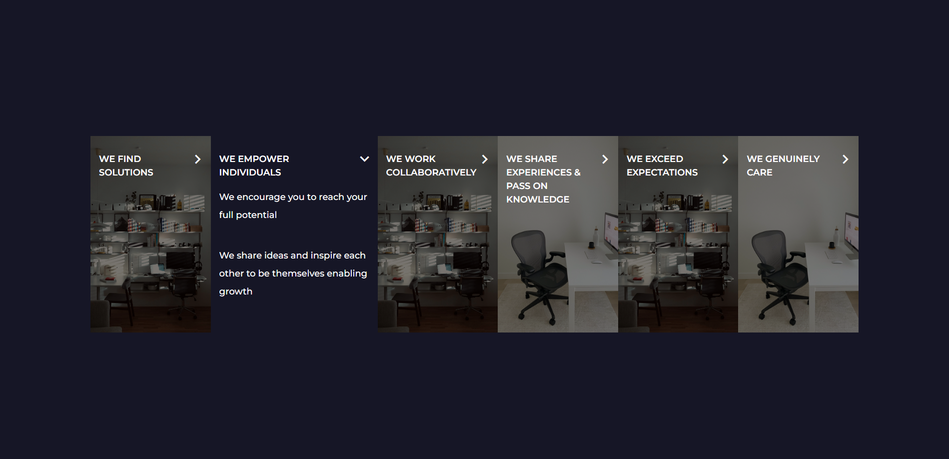
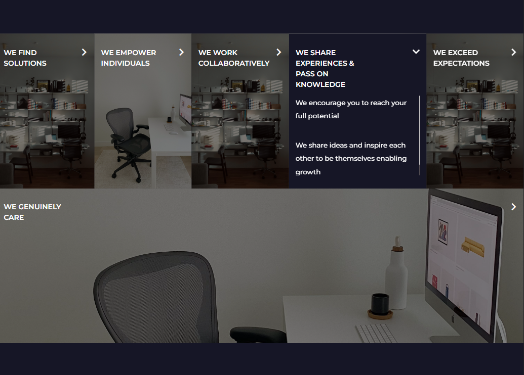
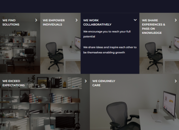
<h3 class="values-list__item-title">WE FIND SOLUTIONS</h3>
<div class="values-list__item-text" data-simplebar>
<p>
Being experts in our field, we work tirelessly to find perfect
recruitment solutions
</p>
<p>We always find a way to deliver</p>
</div>
</li>
<li class="values-list__item">
<img
src="images/value-img-2.jpg"
alt=""
class="values-list__item-img"
/>
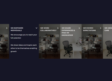
<h3 class="values-list__item-title">WE EMPOWER INDIVIDUALS</h3>
<div class="values-list__item-text" data-simplebar>
<p>We encourage you to reach your full potential</p>
<p>
We share ideas and inspire each other to be themselves enabling growth
</p>
</div>
</li>
<li class="values-list__item">
<img
src="images/value-img-1.jpg"
alt=""
class="values-list__item-img"
/>
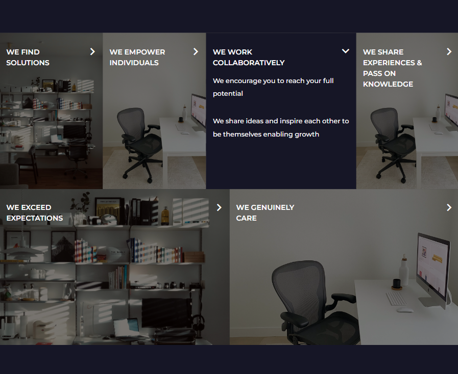
<h3 class="values-list__item-title">WE WORK COLLABORATIVELY</h3>
<div class="values-list__item-text" data-simplebar>
<p>We encourage you to reach your full potential</p>
<p>
We share ideas and inspire each other to be themselves enabling growth
</p>
</div>
</li>
<li class="values-list__item">
<img
src="images/value-img-2.jpg"
alt=""
class="values-list__item-img"
/>
<h3 class="values-list__item-title">
WE SHARE EXPERIENCES & PASS ON KNOWLEDGE
</h3>
<div class="values-list__item-text" data-simplebar>
<p>We encourage you to reach your full potential</p>
<p>
We share ideas and inspire each other to be themselves enabling growth
</p>
</div>
</li>
<li class="values-list__item">
<img
src="images/value-img-1.jpg"
alt=""
class="values-list__item-img"
/>
<h3 class="values-list__item-title">WE EXCEED EXPECTATIONS</h3>
<div class="values-list__item-text" data-simplebar>
<p>We encourage you to reach your full potential</p>
<p>
We share ideas and inspire each other to be themselves enabling growth
</p>
</div>
</li>
<li class="values-list__item">
<img
src="images/value-img-2.jpg"
alt=""
class="values-list__item-img"
/>
<h3 class="values-list__item-title">WE GENUINELY CARE</h3>
<div class="values-list__item-text" data-simplebar>
<p>We encourage you to reach your full potential</p>
<p>
We share ideas and inspire each other to be themselves enabling growth
</p>
</div>
</li>
</ul>
</section>
                            .our-values__section-title {
  margin-bottom: 32px;
}

.values-list {
  display: flex;
  flex-wrap: wrap;

  max-width: 1366px;

  margin: 0 auto;

  @include media(501) {
    flex-direction: column;
    flex-wrap: nowrap;
  }
}

.values-list__item {
  --card-width: 227px;

  position: relative;

  display: flex;
  flex-direction: column;
  flex-grow: 1;
  flex-shrink: 1;
  flex-basis: var(--card-width);

  height: 350px;

  padding: 30px 15px;

  color: var(--white);

  cursor: pointer;

  transition: flex ease 250ms, max-height ease 250ms;

  @include media(501) {
    max-height: 77px;
    padding: 0;
    transition: flex ease 600ms, max-height ease 600ms;
  }

  &::before {
    content: "";
    position: absolute;
    top: 0;
    bottom: 0;
    left: 0;
    right: 0;
    z-index: -1;

    background-color: rgba(0, 0, 0, 0.5);

    transition: background-color ease 250ms;

    @include media(501) {
      transition: background-color ease 600ms;
    }
  }

  &::after {
    content: "\e900";
    position: absolute;
    top: 33px;
    right: 15px;

    font-family: "icomoon" !important;
    speak: never;
    font-style: normal;
    font-weight: normal;
    font-variant: normal;
    text-transform: none;
    line-height: 1;
    -webkit-font-smoothing: antialiased;

    transition: transform ease 250ms;

    @include media(501) {
      transition: transform ease 600ms;
    }
  }

  &.active {
    @include media(501) {
      max-height: 1000px;
    }

    &::before {
      background-color: var(--black);
    }

    &::after {
      transform: rotate(90deg);
    }

    .values-list__item-text {
      overflow: auto;

      max-height: 100%;

      opacity: 1;
      visibility: visible;

      transition: opacity 250ms ease 250ms, visibility 250ms ease 250ms;

      @include media(501) {
        transition: opacity 600ms ease, visibility 600ms ease;
      }

      .simplebar-offset {
        padding-right: 14px;
      }

      .simplebar-scrollbar {
        &::before {
          background-color: var(--white);
        }
      }
    }
  }
}

.values-list__item-img {
  position: absolute;
  top: 0;
  left: 0;
  z-index: -2;

  width: 100%;
  height: 100%;
  object-fit: cover;
}

.values-list__item-title {
  max-width: 150px;
  text-transform: uppercase;

  margin-bottom: 15px;

  font-size: 16px;
  font-weight: 600;
  line-height: 1.5;

  @include media(501) {
    display: flex;
    align-items: center;

    max-width: 100%;
    height: 77px;

    padding: 0 15px;
    margin-bottom: 0;
  }
}

.values-list__item-text {
  width: 100%;

  font-size: 16px;
  font-weight: 300;

  visibility: hidden;
  opacity: 0;

  transition: opacity 0ms ease, visibility 0ms ease;

  &::-webkit-scrollbar {
    width: 2px;
  }

  &::-webkit-scrollbar-thumb {
    background: #fff;
  }

  &::-webkit-scrollbar-track {
    background: #736b6b;
  }

  @include media(501) {
    padding: 0 15px;
  }

  p {
    &:not(:last-child) {
      margin-bottom: 15px;
    }
  }
}
                            .our-values__section-title {
  margin-bottom: 32px;
}

.values-list {
  display: flex;
  flex-wrap: wrap;

  max-width: 1366px;

  margin: 0 auto;

  @mixin media 501 {
    flex-direction: column;
    flex-wrap: nowrap;
  }
}

.values-list__item {
  --card-width: 227px;

  position: relative;

  display: flex;
  flex-direction: column;
  flex-grow: 1;
  flex-shrink: 1;
  flex-basis: var(--card-width);

  height: 350px;

  padding: 30px 15px;

  color: var(--white);

  cursor: pointer;

  transition: flex ease 250ms, max-height ease 250ms;

  @mixin media 501 {
    max-height: 77px;
    padding: 0;
    transition: flex ease 600ms, max-height ease 600ms;
  }

  &::before {
    content: "";
    position: absolute;
    top: 0;
    bottom: 0;
    left: 0;
    right: 0;
    z-index: -1;

    background-color: rgba(0,0,0,0.5);

    transition: background-color ease 250ms;

    @mixin media 501 {
      transition: background-color ease 600ms;
    }
  }

  &::after {
    content: "\e900";
    position: absolute;
    top: 33px;
    right: 15px;

    font-family: "icomoon" !important;
    speak: never;
    font-style: normal;
    font-weight: normal;
    font-variant: normal;
    text-transform: none;
    line-height: 1;
    -webkit-font-smoothing: antialiased;

    transition: transform ease 250ms;

    @mixin media 501 {
      transition: transform ease 600ms;
    }
  }

  &.active {
    @mixin media 501 {
      max-height: 1000px;
    }

    &::before {
      background-color: var(--black);
    }

    &::after {
      transform: rotate(90deg);
    }

    .values-list__item-text {
      overflow: auto;

      max-height: 100%;

      /* padding-bottom: 24px; */

      opacity: 1;
      visibility: visible;

      transition: opacity 250ms ease 250ms, visibility 250ms ease 250ms;

      @mixin media 501 {
        transition: opacity 600ms ease, visibility 600ms ease;
      }

      .simplebar-offset {
        padding-right: 14px;
      }

      .simplebar-scrollbar {
        &::before {
          background-color: var(--white);
        }
      }
    }
  }
}

.values-list__item-img {
  position: absolute;
  top: 0;
  left: 0;
  z-index: -2;

  width: 100%;
  height: 100%;
  object-fit: cover;
}

.values-list__item-title {
  max-width: 150px;
  text-transform: uppercase;

  margin-bottom: 15px;

  font-size: 16px;
  font-weight: 600;
  line-height: 1.5;

  @mixin media 501 {
    display: flex;
    align-items: center;

    max-width: 100%;
    height: 77px;

    padding: 0 15px;
    margin-bottom: 0;
  }
}

.values-list__item-text {
  width: 100%;

  font-size: 16px;
  font-weight: 300;

  visibility: hidden;
  opacity: 0;

  transition: opacity 0ms ease, visibility 0ms ease;

  &::-webkit-scrollbar {
    width: 2px;
  }

  &::-webkit-scrollbar-thumb {
    background: #fff;
  }

  &::-webkit-scrollbar-track {
    background: #736b6b;
  }

  @mixin media 501 {
    padding: 0 15px;
  }

  p {
    &:not(:last-child) {
      margin-bottom: 15px;
    }
  }
}
                            const ourValues = document.querySelector(".our-values");
if (ourValues) {
  const isMob = window.matchMedia("(max-width: 500px)").matches;
  const valueItems = ourValues.querySelectorAll(".values-list__item");
  let gridCard = takeGridSet(valueItems);
  let activeIndex = null;
  let trueArr = [];
  let { offsetWidth: valueListBlockWidth } =
    ourValues.querySelector(".values-list");
  let trueIndex = 0;

  if (isMob) {
    valueItems.forEach((item, idx) => {
      item.addEventListener("click", () => {
        // Якщо карточка на яку ми натискаємо вже активна, робимо її неактивною
        //  і виходимо з функції
        if (idx === activeIndex) {
          item.classList.remove("active");
          activeIndex = null;
          return;
        }

        // Якщо активна карточка вже є, робимо її неактивною, а ту на яку
        // натиснули робимо активною
        if (activeIndex !== null) {
          valueItems[activeIndex].classList.remove("active");
        }

        activeIndex = idx;

        item.classList.add("active");
      });
    });
  } else {
    valueItems.forEach((item, idx) => {
      item.addEventListener("click", () => {
        // Якщо карточка на яку ми натискаємо вже активна, робимо її
        // неактивною і перераховуємо ширину карток в рядку і виходимо з функції
        if (idx === activeIndex) {
          item.classList.remove("active");

          for (let i = 0; i < trueArr.length; i++) {
            trueArr[i].style.flexBasis = `${Math.floor(
              valueListBlockWidth / trueArr.length - 2
            )}px`;
            activeIndex = null;
          }
          return;
        }

        // якщо вже є активна картка робимо її не активною, а ту на яку
        // натиснули робюимо активною і перераховуємо ширини карток в рядку
        if (activeIndex !== null) {
          valueItems[activeIndex].classList.remove("active");

          for (let i = 0; i < trueArr.length; i++) {
            trueArr[i].style.flexBasis = `${Math.floor(
              valueListBlockWidth / trueArr.length - 2
            )}px`;
          }
        }

        activeIndex = idx;

        item.classList.add("active");

        let accum = 0;

        for (let i = 0; i < gridCard.length; i++) {
          accum += gridCard[i].length;

          if (idx < accum) {
            trueIndex =
              (idx - (accum - gridCard[i].length)) % gridCard[i].length;
            trueArr = gridCard[i];
            break;
          }
        }

        let cardWidth = valueListBlockWidth / trueArr.length;

        for (let i = 0; i < trueArr.length; i++) {
          if (i === trueIndex) {
            trueArr[i].style.flexBasis = `${Math.floor(cardWidth * 1.3)}px`;
          } else {
            trueArr[i].style.flexBasis = `${Math.floor(
              cardWidth - (cardWidth * 0.3) / (trueArr.length - 1) - 2
            )}px`;
          }
        }
      });
    });
  }

  window.addEventListener("resize", () => {
    const activeItem = ourValues.querySelector(".values-list__item.active");

    activeItem?.classList.remove("active");

    activeIndex = null;

    // записуємо нову ширину блоку для корректного калькулювання ширини карточки
    valueListBlockWidth = ourValues.querySelector(".values-list").offsetWidth;

    gridCard = takeGridSet(valueItems);

    valueItems.forEach((item) => (item.style.flexBasis = ""));
  });

  function takeGridSet(valueItems) {
    let gridCard = [];
    let buffer = [];

    for (let i = 0; i < valueItems.length; i++) {
      if (
        i > 0 &&
        valueItems[i].getBoundingClientRect().top !==
        valueItems[i - 1].getBoundingClientRect().top
      ) {
        gridCard.push(buffer);
        buffer = [];
      }

      if (i === valueItems.length - 1) {
        gridCard.push(buffer);
      }

      buffer.push(valueItems[i]);
    }
    return gridCard;
  }
}