


Footers
Footer
19 Sep 2022
Footer section
HTML
SCSS
PostCSS
JS
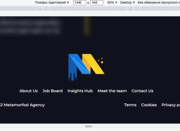
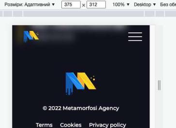
                            <footer class="footer">
  <div class="cont">
    <a href="./index.html" class="logo">
      <img src="./images/logo.svg" alt="" />
    </a>
    <navbar class="navbar">
      <a href="./about-us.html">About Us</a>
      <a href="./job-search.html">Job Board</a>
      <a href="./insights.html">Insights Hub</a>
      <a href="./meet-the-team.html">Meet the team</a>
      <a href="./contact-us.html">Contact Us</a>
    </navbar>
    <div class="bottom-info">
      <p>© 2022 Metamorfosi Agency</p>

      <navbar class="navbar">
        <a href="./terms.html">Terms</a>
        <a href="./cookies.html">Cookies</a>
        <a href="./policy.html">Privacy policy</a>
      </navbar>
    </div>

    <a
      href="https://www.boldidentities.com/"
      target="_blank"
      id="bold-credits"
    ></a>
  </div>
</footer>
                            .footer {
  .navbar {
    display: flex;
    align-items: center;
    justify-content: center;
    margin-right: -20px;

    a {
      margin-right: 20px;
    }

    & > div {
      position: relative;

      &:hover {
        .sub-btn {
          & > * {
            color: var(--primary);
          }

          span {
            transform: rotate(180deg);
          }
        }

        .sub-menu {
          padding: 15px;
          max-height: 500px;
          opacity: 1;
        }
      }
    }

    .sub-btn {
      margin-right: 15px;

      a {
        margin-right: 0;
      }

      span {
        font-size: 12px;
        padding: 0 5px;
        margin-top: 0;
      }
    }

    .sub-menu {
      position: absolute;
      bottom: 0;
      left: 0;
      align-items: flex-start;
      display: flex;
      min-width: calc(100% + 15px);
      transform: translate(-15px, 105%);

      background-color: var(--bg-second);
      border-radius: ac(20px, 10px);
      white-space: nowrap;

      a {
        margin-right: 0;

        &:not(:last-child) {
          margin-bottom: 10px;
        }

        &::before {
          display: none;
        }
      }
    }
  }

  .mobile-navbar {
    display: flex;
    flex-direction: column;
    align-items: center;
    max-height: 60vh;
    overflow: auto;
    width: 100%;

    .simplebar-content {
      display: flex;
      flex-direction: column;
      align-items: center;
    }

    .sub-btn {
      margin-right: -36px;

      span {
        margin-left: 20px;
      }

      &.active {
        a,
        span {
          color: var(--primary);
        }

        .sub-btn {
          a {
            margin-bottom: 10px;
          }
        }

        span {
          transform: rotate(180deg);
        }
      }
    }

    .sub-menu {
      overflow: auto;

      a {
        font-size: ac(28px, 18px, 375, 1025);
        margin-top: 15px;

        &:first-child {
          margin-top: 0;
        }
      }

      &.active {
        margin-top: 10px;
        max-height: ac(300px, 200px);
        opacity: 1;
      }
    }
  }

  .sub-btn {
    display: flex;
    align-items: center;
    justify-content: center;

    span {
      margin-top: ac(15px, 20px, 375, 1025);
      transition: 0.3s ease;
      cursor: pointer;

      &:hover {
        color: var(--primary);
      }
    }
  }

  .sub-menu {
    display: flex;
    flex-direction: column;
    align-items: center;
    max-height: 0;
    overflow: hidden;
    transition: 0.3s ease;
    opacity: 0;
  }

  .simplebar-track.simplebar-vertical {
    background-color: var(--white);
    width: 10px;
    border-radius: 20px;
  }

  .simplebar-content-wrapper {
    padding: 0 15px;
  }

  .simplebar-scrollbar::before {
    background-color: var(--primary);
    opacity: 1;
  }

  a {
    position: relative;
    @include transition-all;

    &:not(.btn) {
      &::before {
        content: "";
        position: absolute;
        bottom: 0;
        right: 0;
        width: 0;
        height: 2px;
        background: var(--white);
        @include transition-all;
      }

      &:hover {
        color: var(--primary);

        &::before {
          width: 100%;
          left: 0;
          background: var(--primary);
        }
      }
    }
  }

  .logo {
    width: ac(150px, 80px);
    flex-shrink: 0;

    &::before {
      display: none;
    }

    &:hover {
      transform: scale(1.06);
    }
  }

  & > .cont {
    display: flex;
    flex-direction: column;
    align-items: center;
    justify-content: center;

    & > .navbar {
      margin-bottom: ac(30px, 20px);
    }
  }

  .logo {
    margin-bottom: ac(30px, 20px);
  }

  .bottom-info {
    display: grid;
    grid-template-columns: repeat(2, 1fr);
    width: min(800px, 100%);

    .navbar {
      margin-left: auto;

      a {
        margin-right: 0;

        &:not(:last-child) {
          margin-right: 20px;
        }
      }
    }

    p {
      padding: 0;
    }
  }

  @include media(650) {
    .cont > .navbar {
      display: none;
    }

    .bottom-info {
      grid-template-columns: 1fr;
      grid-row-gap: 20px;

      .navbar,
      p {
        margin: 0 auto;
      }
    }
  }
}
                            .footer {
  .navbar {
    display: flex;
    align-items: center;
    justify-content: center;
    margin-right: -20px;

    a {
      margin-right: 20px;
    }

    & > div {
      position: relative;

      &:hover {
        .sub-btn {
          & > * {
            color: var(--primary);
          }

          span {
            transform: rotate(180deg);
          }
        }

        .sub-menu {
          padding: 15px;
          max-height: 500px;
          opacity: 1;
        }
      }
    }

    .sub-btn {
      margin-right: 15px;

      a {
        margin-right: 0;
      }

      span {
        font-size: 12px;
        padding: 0 5px;
        margin-top: 0;
      }
    }

    .sub-menu {
      position: absolute;
      bottom: 0;
      left: 0;
      align-items: flex-start;
      display: flex;
      min-width: calc(100% + 15px);
      transform: translate(-15px, 105%);

      background-color: var(--bg-second);
      border-radius: ac(20px, 10px);
      white-space: nowrap;

      a {
        margin-right: 0;

        &:not(:last-child) {
          margin-bottom: 10px;
        }

        &::before {
          display: none;
        }
      }
    }
  }

  .mobile-navbar {
    display: flex;
    flex-direction: column;
    align-items: center;
    max-height: 60vh;
    overflow: auto;
    width: 100%;

    .simplebar-content {
      display: flex;
      flex-direction: column;
      align-items: center;
    }

    .sub-btn {
      margin-right: -36px;

      span {
        margin-left: 20px;
      }

      &.active {
        a,
        span {
          color: var(--primary);
        }

        .sub-btn {
          a {
            margin-bottom: 10px;
          }
        }

        span {
          transform: rotate(180deg);
        }
      }
    }

    .sub-menu {
      overflow: auto;

      a {
        font-size: ac(28px, 18px, 375, 1025);
        margin-top: 15px;

        &:first-child {
          margin-top: 0;
        }
      }

      &.active {
        margin-top: 10px;
        max-height: ac(300px, 200px);
        opacity: 1;
      }
    }
  }

  .sub-btn {
    display: flex;
    align-items: center;
    justify-content: center;

    span {
      margin-top: ac(15px, 20px, 375, 1025);
      transition: 0.3s ease;
      cursor: pointer;

      &:hover {
        color: var(--primary);
      }
    }
  }

  .sub-menu {
    display: flex;
    flex-direction: column;
    align-items: center;
    max-height: 0;
    overflow: hidden;
    transition: 0.3s ease;
    opacity: 0;
  }

  .simplebar-track.simplebar-vertical {
    background-color: var(--white);
    width: 10px;
    border-radius: 20px;
  }

  .simplebar-content-wrapper {
    padding: 0 15px;
  }

  .simplebar-scrollbar::before {
    background-color: var(--primary);
    opacity: 1;
  }

  a {
    position: relative;
    @mixin transition-all;

    &:not(.btn) {
      &::before {
        content: "";
        position: absolute;
        bottom: 0;
        right: 0;
        width: 0;
        height: 2px;
        background: var(--white);
        @mixin transition-all;
      }

      &:hover {
        color: var(--primary);

        &::before {
          width: 100%;
          left: 0;
          background: var(--primary);
        }
      }
    }
  }
  .logo {
    width: ac(150px, 80px);
    flex-shrink: 0;

    &::before {
      display: none;
    }

    &:hover {
      transform: scale(1.06);
    }
  }
  & > .cont {
    display: flex;
    flex-direction: column;
    align-items: center;
    justify-content: center;

    & > .navbar {
      margin-bottom: ac(30px, 20px);
    }
  }

  .logo {
    margin-bottom: ac(30px, 20px);
  }

  .bottom-info {
    display: grid;
    grid-template-columns: repeat(2, 1fr);
    width: min(800px, 100%);

    .navbar {
      margin-left: auto;

      a {
        margin-right: 0;

        &:not(:last-child) {
          margin-right: 20px;
        }
      }
    }

    p {
      padding: 0;
    }
  }

  @mixin media 650 {
    .cont > .navbar {
      display: none;
    }

    .bottom-info {
      grid-template-columns: 1fr;
      grid-row-gap: 20px;

      .navbar,
      p {
        margin: 0 auto;
      }
    }
  }
}
                            // BOLD Lottie init (Має бути в самому кінці файлу)
  lottie.loadAnimation({
    container: document.getElementById(`bold-credits`),
    renderer: "svg",
    loop: true,
    autoplay: true,
    path: "./js/lottie/BOLD-white-logo.json",
  });