


Headers
Header with dynamic width
22 Mar 2023

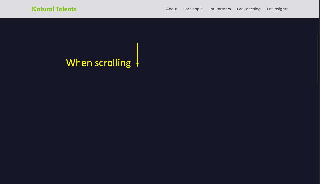


Класний хедер, який динамічно міняє ширину при скроллі і прилипає к верху
HTML
SCSS
PostCSS
JS
                            <header class="header">
  <div class="cont">
    <div class="navbar">
      <a href="./index.html" class="logo">
        <img src="./images/logo-primary.svg" alt="Natural talents" />
      </a>

      <nav class="navbar__menu">
        <ul class="navbar__list flex items-center">
          <li class="navbar__list-item">
            <a class="navbar__list-link" href="./about.html">About</a>
          </li>

          <li class="navbar__list-item">
            <a class="navbar__list-link" href="./people.html">For People</a>
          </li>

          <li class="navbar__list-item">
            <a class="navbar__list-link" href="./partners.html"> For Partners</a>
          </li>

          <li class="navbar__list-item">
            <a class="navbar__list-link" href="./coaching.html">For Coaching</a>
          </li>

          <li class="navbar__list-item">
            <a class="navbar__list-link" href="./insights.html">For Insights</a>
          </li>
        </ul>
      </nav>

      <div class="burger menu-toggle">
        <span></span>
      </div>
    </div>
  </div>
</header>

<div class="header-close-wrapper"></div>
                            /* ----------------------- Common desktop header ----------------------- */
.header {
  position: fixed;
  transition: all ease-in-out 0.25s, border-radius ease 0.4s;
  width: 100%;
  top: 30px;
  left: 50%;
  transform: translateX(-50%);
  right: 0;
  z-index: 999;

  max-width: 88.8vw;
  border-radius: 100px;
  overflow: hidden;

  height: ac(80px, 60px);

  display: flex;
  align-items: center;

  background-color: var(--white);
  color: var(--black);
  box-shadow: 0 10px 20px rgb(28 27 28 / 10%);

  @include min-media(1440) {
  max-width: 1278px;
}

  .cont {
    max-width: 80.5vw;
    width: 100%;

    @include min-media(1440) {
    max-width: 1160px;
  }

    @include media(415) {
    max-width: 70vw;
  }
  }

  &.scrolled {
    max-width: 100%;
    border-radius: 0;
    top: 0;
    background-color: rgb(255 255 255 / 86%);
    backdrop-filter: blur(10px);
  }

  .logo {
    height: 100%;
    width: ac(207px, 137px);
    flex-shrink: 0;
    transition: setTransition(transform);

    &::before {
      display: none;
    }

    &:hover {
      transform: scale(1.06);
    }

    img {
      width: 100%;
      height: 100%;
      object-fit: contain;
    }
  }

  .navbar {
    display: flex;
    align-items: center;
    justify-content: space-between;
  }

  .navbar__list {
    transition: setTransition(opacity);

    &-item {
      color: var(--black);
      font-size: 16px;
      position: relative;
      overflow: hidden;

      &:not(:last-child) {
        margin-right: 27px;
      }

      &:before {
        content: '';
        position: absolute;
        width: 0;
        height: 2px;
        bottom: 0;
        right: 0;
        background: var(--black);
        border-radius: 10px;
        transition: 0.4s ease-in-out;
      }

      &:hover {
        &:before {
          left: 0;
          right: auto;
          width: 100%;
        }
      }
    }

    &-link {
      color: var(--black);
    }
  }

  .burger {
    display: none;
  }

  @include media(415) {
  max-width: 85.5vw;
}
}

/* end of Common desktop header */

/* ----------------------- Common desktop header Mobile HEADER ----------------------- */

@include media(991) {
.header {
  align-items: flex-start;

  .navbar {
    height: ac(80px, 60px);
  }

  .burger,
  .menu-toggle {
    display: flex;
  }

  .navbar__menu {
    position: absolute;
    width: 100%;
    top: ac(80px, 60px);
    left: 0;
    transition: 0.25s ease;

    pointer-events: none;
    overflow: hidden;

    .navbar__list {
      opacity: 0;
      padding: 63px 0 112px;
      flex-direction: column;

      &-item {
        &:not(:last-child) {
          margin: 0 0 35px;
        }

        &:last-child {
          padding: 0;
        }
      }

      &-link {
        font-size: 30px;
        font-weight: 500;
      }
    }
  }

  &.active {
    border-radius: 20px;

    .navbar__menu {
      pointer-events: auto;

      .navbar__list {
        opacity: 1;
      }
    }

    &.scrolled {
      border-radius: 0 0 20px 20px;
    }
  }
}
}

/* end of Common desktop header Mobile HEADER */

/* ----------------------- ONLY Mobile HEADER ----------------------- */
.header.header-mobile {
  .burger {
    display: flex;
  }
}

/* end of ONLY Mobile HEADER */

/* ----------------------- HEADER COMPONENTS ----------------------- */
.burger,
.menu-toggle {
  position: relative;
  flex-direction: column;
  justify-content: center;
  cursor: pointer;
  width: ac(48px, 36px, 375, 900);
  height: 18px;
  display: flex;

  span {
    width: 100%;
    height: 1px;
    background: var(--black);
    transition: all 0.1s;
    position: relative;

    &::before,
    &::after {
      position: absolute;
      content: "";
      left: 0;
      width: 100%;
      height: 1px;
      background: var(--black);

      transition: all 0.2s;
    }

    &::before {
      top: -10px;
    }

    &::after {
      bottom: -10px;
    }
  }

  @include transition-all;

  &.active {
    height: 40px;

    span {
      background: transparent;

      &::before {
        top: 0;
        transform: rotate(-45deg);
      }

      &::after {
        top: 0;
        transform: rotate(45deg);
      }
    }

    &:hover {
      height: 40px;
    }
  }
}

.header-close-wrapper {
  position: fixed;
  width: 100%;
  height: 100%;
  top: 0;
  right: 0;
  bottom: 0;
  left: 0;
  z-index: 77;
  pointer-events: none;
  visibility: hidden;
  opacity: 0;

  @include transition-all;

  &.active {
    visibility: visible;
    pointer-events: auto;
    opacity: 1;
    cursor: pointer;
  }
}

/* end of HEADER COMPONENTS */
                            /* ----------------------- Common desktop header ----------------------- */
.header {
  position: fixed;
  transition: all ease-in-out 0.25s, border-radius ease 0.4s;
  width: 100%;
  top: 30px;
  left: 50%;
  transform: translateX(-50%);
  right: 0;
  z-index: 999;

  max-width: 88.8vw;
  border-radius: 100px;
  overflow: hidden;

  height: ac(80px, 60px);

  display: flex;
  align-items: center;

  background-color: var(--white);
  color: var(--black);
  box-shadow: 0 10px 20px rgb(28 27 28 / 10%);

  @mixin min-media 1440 {
    max-width: 1278px;
  }

  .cont {
    max-width: 80.5vw;
    width: 100%;

    @mixin min-media 1440 {
      max-width: 1160px;
    }

    @mixin media 415 {
      max-width: 70vw;
    }
  }

  &.scrolled {
    max-width: 100%;
    border-radius: 0;
    top: 0;
    background-color: rgb(255 255 255 / 86%);
    backdrop-filter: blur(10px);
  }

  .logo {
    height: 100%;
    width: ac(207px, 137px);
    flex-shrink: 0;
    transition: setTransition(transform);

    &::before {
      display: none;
    }

    &:hover {
      transform: scale(1.06);
    }

    img {
      width: 100%;
      height: 100%;
      object-fit: contain;
    }
  }

  .navbar {
    display: flex;
    align-items: center;
    justify-content: space-between;
  }

  .navbar__list {
    transition: setTransition(opacity);

    &-item {
      color: var(--black);
      font-size: 16px;
      position: relative;
      overflow: hidden;

      &:not(:last-child) {
        margin-right: 27px;
      }

      &:before {
        content: '';
        position: absolute;
        width: 0;
        height: 2px;
        bottom: 0;
        right: 0;
        background: var(--black);
        border-radius: 10px;
        transition: 0.4s ease-in-out;
      }

      &:hover {
        &:before {
          left: 0;
          right: auto;
          width: 100%;
        }
      }
    }

    &-link {
      color: var(--black);
    }
  }

  .burger {
    display: none;
  }

  @mixin media 415 {
    max-width: 85.5vw;
  }
}

/* end of Common desktop header */

/* ----------------------- Common desktop header Mobile HEADER ----------------------- */

@mixin media 991 {
  .header {
    align-items: flex-start;

    .navbar {
      height: ac(80px, 60px);
    }

    .burger,
    .menu-toggle {
      display: flex;
    }

    .navbar__menu {
      position: absolute;
      width: 100%;
      top: ac(80px, 60px);
      left: 0;
      transition: 0.25s ease;

      pointer-events: none;
      overflow: hidden;

      .navbar__list {
        opacity: 0;
        padding: 63px 0 112px;
        flex-direction: column;

        &-item {
          &:not(:last-child) {
            margin: 0 0 35px;
          }

          &:last-child {
            padding: 0;
          }
        }

        &-link {
          font-size: 30px;
          font-weight: 500;
        }
      }
    }

    &.active {
      border-radius: 20px;

      .navbar__menu {
        pointer-events: auto;

        .navbar__list {
          opacity: 1;
        }
      }

      &.scrolled {
        border-radius: 0 0 20px 20px;
      }
    }
  }
}

/* end of Common desktop header Mobile HEADER */

/* ----------------------- ONLY Mobile HEADER ----------------------- */
.header.header-mobile {
  .burger {
    display: flex;
  }
}

/* end of ONLY Mobile HEADER */

/* ----------------------- HEADER COMPONENTS ----------------------- */
.burger,
.menu-toggle {
  position: relative;
  flex-direction: column;
  justify-content: center;
  cursor: pointer;
  width: ac(48px, 36px, 375, 900);
  height: 18px;
  display: flex;

  span {
    width: 100%;
    height: 1px;
    background: var(--black);
    transition: all 0.1s;
    position: relative;

    &::before,
    &::after {
      position: absolute;
      content: "";
      left: 0;
      width: 100%;
      height: 1px;
      background: var(--black);

      transition: all 0.2s;
    }

    &::before {
      top: -10px;
    }

    &::after {
      bottom: -10px;
    }
  }

  @mixin transition-all;

  &.active {
    height: 40px;

    span {
      background: transparent;

      &::before {
        top: 0;
        transform: rotate(-45deg);
      }

      &::after {
        top: 0;
        transform: rotate(45deg);
      }
    }

    &:hover {
      height: 40px;
    }
  }
}

.header-close-wrapper {
  position: fixed;
  width: 100%;
  height: 100%;
  top: 0;
  right: 0;
  bottom: 0;
  left: 0;
  z-index: 77;
  pointer-events: none;
  visibility: hidden;
  opacity: 0;

  @mixin transition-all;

  &.active {
    visibility: visible;
    pointer-events: auto;
    opacity: 1;
    cursor: pointer;
  }
}

/* end of HEADER COMPONENTS */
                            const header = document.getElementsByClassName(`header`)[0];
const mobileMenu = header.querySelector(".navbar__menu");
const headerHeight = header.clientHeight;

// Header scroll
if (window.scrollY > 0) {
  header.classList.add("scrolled");
}
document.addEventListener("scroll", () => {
  if (window.scrollY > 0) {
    header.classList.add("scrolled");
  } else if (window.scrollY === 0) {
    header.classList.remove("scrolled");
  }
});

function menuToggle() {
  $(".menu-toggle").toggleClass("active");
  $(".header").toggleClass("active");
  $(".header-close-wrapper").toggleClass("active");

  if (header.classList.contains('active')) {
    header.style.height = mobileMenu.scrollHeight + headerHeight + "px";
  } else {
    header.style.height = headerHeight + "px";
  }

  // LockScroll when burger open and enable when closed and enable scroll on menu
  scrollLock.getScrollState()
      ? scrollLock.disablePageScroll(document.querySelector(".navbar-nav .menu"))
      : scrollLock.enablePageScroll();
}

$(".menu-toggle").click(menuToggle); //menu toggles
$(".header-close-wrapper").click(menuToggle); //menu toggles