


Elements
Rotation circle scroll label
19 May 2023
HTML
SCSS
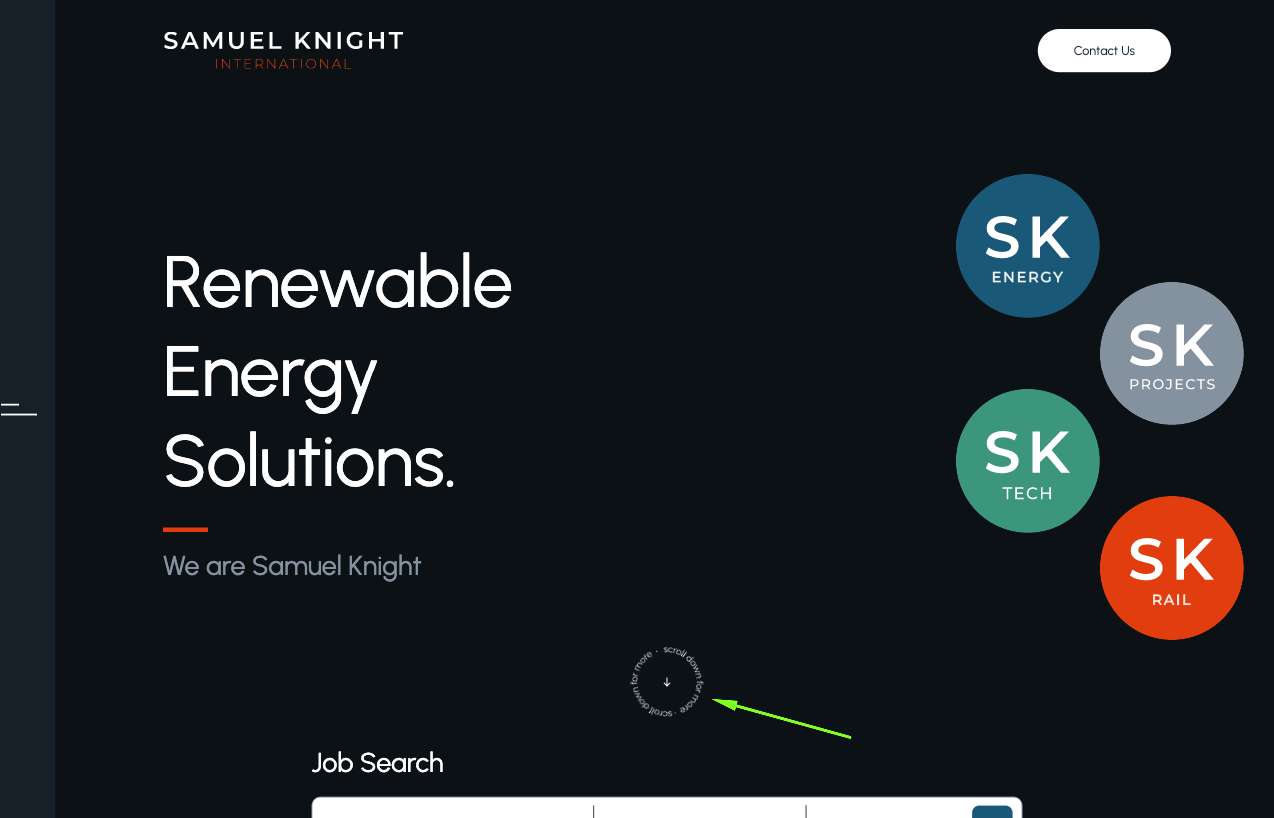
                            <a class="scroll-down-label" href="#hero-form-section">
    <img alt="scroll-label" src="./images/scroll-label.svg">
    <i class="icon-arrow-down-long"></i>
</a>
                            /*---------- icomoon fonts ----------*/
@font-face {
    font-family: 'icomoon';
    src:  url('../fonts/icomoon.eot?kqvu89');
    src:  url('../fonts/icomoon.eot?kqvu89#iefix') format('embedded-opentype'),
    url('../fonts/icomoon.woff2?kqvu89') format('woff2'),
    url('../fonts/icomoon.ttf?kqvu89') format('truetype'),
    url('../fonts/icomoon.woff?kqvu89') format('woff'),
    url('../fonts/icomoon.svg?kqvu89#icomoon') format('svg');
    font-weight: normal;
    font-style: normal;
    font-display: block;
}


[class^="icon-"], [class*=" icon-"] {
    /* use !important to prevent issues with browser extensions that change fonts */
    font-family: 'icomoon' !important;
    speak: never;
    font-style: normal;
    font-weight: normal;
    font-variant: normal;
    text-transform: none;
    line-height: 1;

    /* Better Font Rendering =========== */
    -webkit-font-smoothing: antialiased;
    -moz-osx-font-smoothing: grayscale;
}

.icon-chewron-down:before {
    content: "\e900";
}
.icon-chewron-up:before {
    content: "\e901";
}
.icon-chewron-left:before {
    content: "\e902";
}
.icon-chewron-right:before {
    content: "\e903";
}
.icon-arrow-right:before {
    content: "\e904";
}
.icon-arrow-down:before {
    content: "\e905";
}
.icon-arrow-left:before {
    content: "\e906";
}
.icon-arrow-up:before {
    content: "\e907";
}
.icon-arrow-down-long:before {
    content: "\e908";
}
.icon-arrow-down-right:before {
    content: "\e909";
}
.icon-instagram:before {
    content: "\e90a";
}
.icon-linkedin:before {
    content: "\e90b";
}
.icon-twitter:before {
    content: "\e90c";
}
/*---------- end of icomoon fonts ----------*/

.scroll-down-label {
    position: absolute;
    left: 50%;
    transform: translate(0%);
    bottom: 122px;
    width: 80px;
    cursor: pointer;

    i {
        display: block;
        position: absolute;
        left: 50%;
        top: 50%;
        transform: translate(-50%, -50%);
        font-size: 10px;

    }

    img {
        animation: rotareScrollLabel infinite 15s linear;

    }

    &:hover {

        i {
            animation: pulseDown 500ms infinite linear alternate;
        }
    }
}

@keyframes rotareScrollLabel {
    100% {
        transform: rotate(360deg);
    }
}

@keyframes pulseDown {
    0% {
        transform: translate(-50%, -50%);
    }
    100% {
        transform: translate(-50%, calc(-50% + 5px));
    }
}
Шрифтова іконка в архіві