


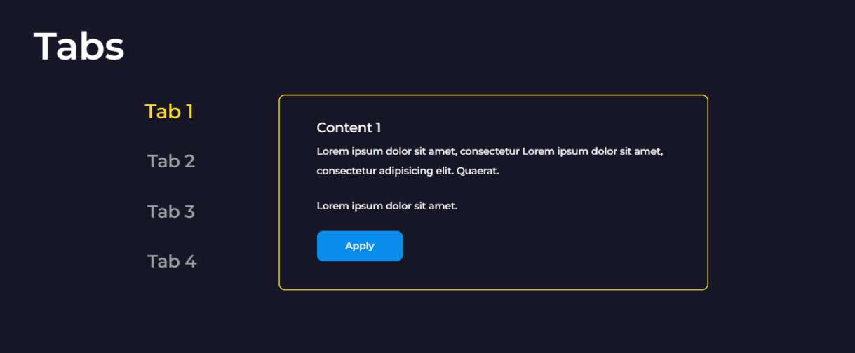
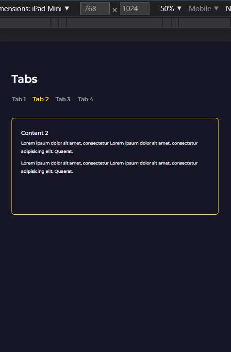
Tabs
Simple Tabs
19 Sep 2022
Simple responsive tabs
HTML
SCSS
PostCSS
JS
<section class="tabs">
<div class="cont">
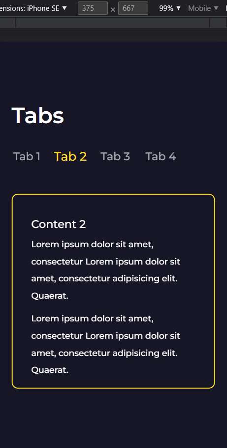
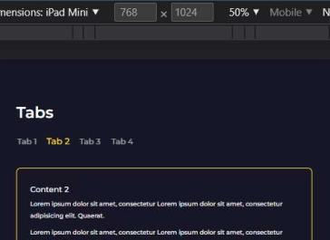
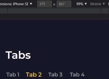
<h2>Tabs</h2>
<div class="tabs-container">
<div class="tabs-header">
<div class="tab-header"><h4>Tab 1</h4></div>
<div class="tab-header"><h4>Tab 2</h4></div>
<div class="tab-header"><h4>Tab 3</h4></div>
<div class="tab-header"><h4>Tab 4</h4></div>
</div>
<div class="tabs-content">
<div class="tab-content">
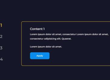
<h6>Content 1</h6>
<p>
Lorem ipsum dolor sit amet, consectetur Lorem ipsum dolor sit amet,
consectetur adipisicing elit. Quaerat.
</p>
<p>Lorem ipsum dolor sit amet.</p>
</div>
<div class="tab-content">
<h6>Content 2</h6>
<p>
Lorem ipsum dolor sit amet, consectetur Lorem ipsum dolor sit amet,
consectetur adipisicing elit. Quaerat.
</p>
<p>
Lorem ipsum dolor sit amet, consectetur Lorem ipsum dolor sit amet,
consectetur adipisicing elit. Quaerat.
</p>
</div>
<div class="tab-content">
<h6>Content 3</h6>
<p>Lorem ipsum dolor sit amet, consectetur</p>
</div>
<div class="tab-content">
<h6>Content 4</h6>
<p>
Lorem ipsum dolor sit amet, consectetur Lorem ipsum dolor sit amet,
consectetur adipisicing elit. Iusto, voluptate.
</p>
</div>
</div>
</div>
</div>
</section>
                            .tabs-container {
  display: flex;
  align-items: center;
  justify-content: space-between;
  max-width: 1048px;
  margin-top: 30px;
}

.tabs-header {
  display: flex;
  align-items: center;
  flex-direction: column;
}

.tab-header {
  opacity: 0.6;
  cursor: pointer;
  transition: opacity 0.3s ease;

  &:not(:last-child) {
    margin-bottom: 20px;
  }

  h4 {
    transform: scale(0.9);
    transition: color 0.3s ease, transform 0.3s ease;
    pointer-events: none;
  }

  &.active {
    opacity: 1;

    h4 {
      color: var(--primary);
      transform: scale(1);
    }
  }

  &:hover {
    h4 {
      color: var(--primary);
      transform: scale(1);
    }
  }
}

.tabs-content {
  max-width: 700px;
  margin: 0 auto;
  width: 100%;
  border-radius: 10px;
  border: 2px solid var(--primary);
  transition: height 0.3s ease;
  overflow: hidden;
}

.tab-content {
  padding: 30px ac(60px, 30px);
  overflow-y: scroll;
  height: 315px;
  display: none;
  animation: fade-in 0.5s ease;

  &.active {
    display: block;
  }

  &::-webkit-scrollbar {
    display: none;
  }
}

@include media(901) {
  .tabs-container {
    flex-direction: column;
    align-items: flex-start;
  }

  .tabs-header {
    margin-bottom: 32px;
    flex-direction: row;
  }

  .tab-header:not(:last-child) {
    margin: 0 20px 0 0;
  }
}

/* Container */
.cont {
  margin: 0 auto;
  max-width: 1280px;
  width: perc(1280);

  @include media(901) {
    width: 89%;
  }
}
                            /* Mixins */

@define-mixin media $width {
    @media only screen and (max-width: $(width)px) {
        @mixin-content;
    }
}


.tabs-container {
    display: flex;
    align-items: center;
    justify-content: space-between;
    max-width: 1048px;
    margin-top: 30px;
}

.tabs-header {
    display: flex;
    align-items: center;
    flex-direction: column;
}

.tab-header {
    opacity: 0.6;
    cursor: pointer;
    transition: opacity 0.3s ease;

    &:not(:last-child) {
        margin-bottom: 20px;
    }

    h4 {
        transform: scale(0.9);
        transition: color 0.3s ease, transform 0.3s ease;
        pointer-events: none;
    }

    &.active {
        opacity: 1;

        h4 {
            color: var(--primary);
            transform: scale(1);
        }
    }

    &:hover {
        h4 {
            color: var(--primary);
            transform: scale(1);
        }
    }
}

.tabs-content {
    max-width: 700px;
    margin: 0 auto;
    width: 100%;
    border-radius: 10px;
    border: 2px solid var(--primary);
    transition: height 0.3s ease;
    overflow: hidden;
}

.tab-content {
    padding: 30px ac(60px, 30px);
    overflow-y: scroll;
    height: 315px;
    display: none;
    animation: fade-in 0.5s ease;

    &.active {
        display: block;
    }

    &::-webkit-scrollbar {
        display: none;
    }
}

@mixin media 901 {
    .tabs-container {
        flex-direction: column;
        align-items: flex-start;
    }

    .tabs-header {
        margin-bottom: 32px;
        flex-direction: row;
    }

    .tab-header:not(:last-child) {
        margin: 0 20px 0 0;
    }
}

 /* Container */

.cont {
  margin: 0 auto;
  max-width: 1280px;
  width: perc(1280);

  @mixin media 901 {
    width: 89%;
  }
}
                            const tabs = document.querySelectorAll(".tab-header"),  // Tabs list
      tabsHeader = document.querySelector(".tabs-header"),  // Parent of tabs list
      tabsContent = document.querySelectorAll(".tab-content"),  // Content List
      contentParent = document.querySelector(".tabs-content");

    // Hide items Function
    function hideItems() {
      tabsContent.forEach((item) => {
        item.classList.remove("active");
      });

      tabs.forEach((item) => {
        item.classList.remove("active");
      });
    }

    // Show items Function
    function showItems(i = 0) {
      tabsContent[i].classList.add("active");
      tabs[i].classList.add("active");
    }

    hideItems();
    showItems();

    // Event delegation
    tabsHeader.addEventListener("click", (event) => {
      const target = event.target;

      if (target && target.classList.contains("tab-header")) {
        tabs.forEach((item, i) => {
          if (target == item) {
            hideItems();
            showItems(i);
          }
        });
      }
    });

// Functions for pcss
const maxWidth = 1440;
const minWidth = 768;

export function ac( startSize, endSize, minBreakpoint = minWidth, maxBreakpoint = maxWidth) {

const startSizeFormatted = startSize.replace("px", "");
const endSizeFormatted = endSize.replace("px", "");

const difference = startSizeFormatted - endSizeFormatted;

if (difference > 0) {
    return `min(max(calc(${endSize} + ${difference} * ((100vw - ${minBreakpoint}px) / ${maxBreakpoint - minBreakpoint})),${endSize}),${startSize})`;
} else {
    return `min(max(calc(${endSize} + ${difference} * ((100vw - ${minBreakpoint}px) / ${maxBreakpoint - minBreakpoint})),${startSize}),${endSize})`;
  }
}

export const perc = (number1, number2 = maxWidth) => `${(number1 * 100) / number2}%`;