


Sliders
Slider with creative effect v.2
22 Mar 2023
Гарний слайдер з використанням ефекту "creative"
HTML
SCSS
PostCSS
JS
<section class="roles-section">
<div class="cont">
<div class="roles-section__wrap">
<div class="roles-section__heading flex-shrink-0">
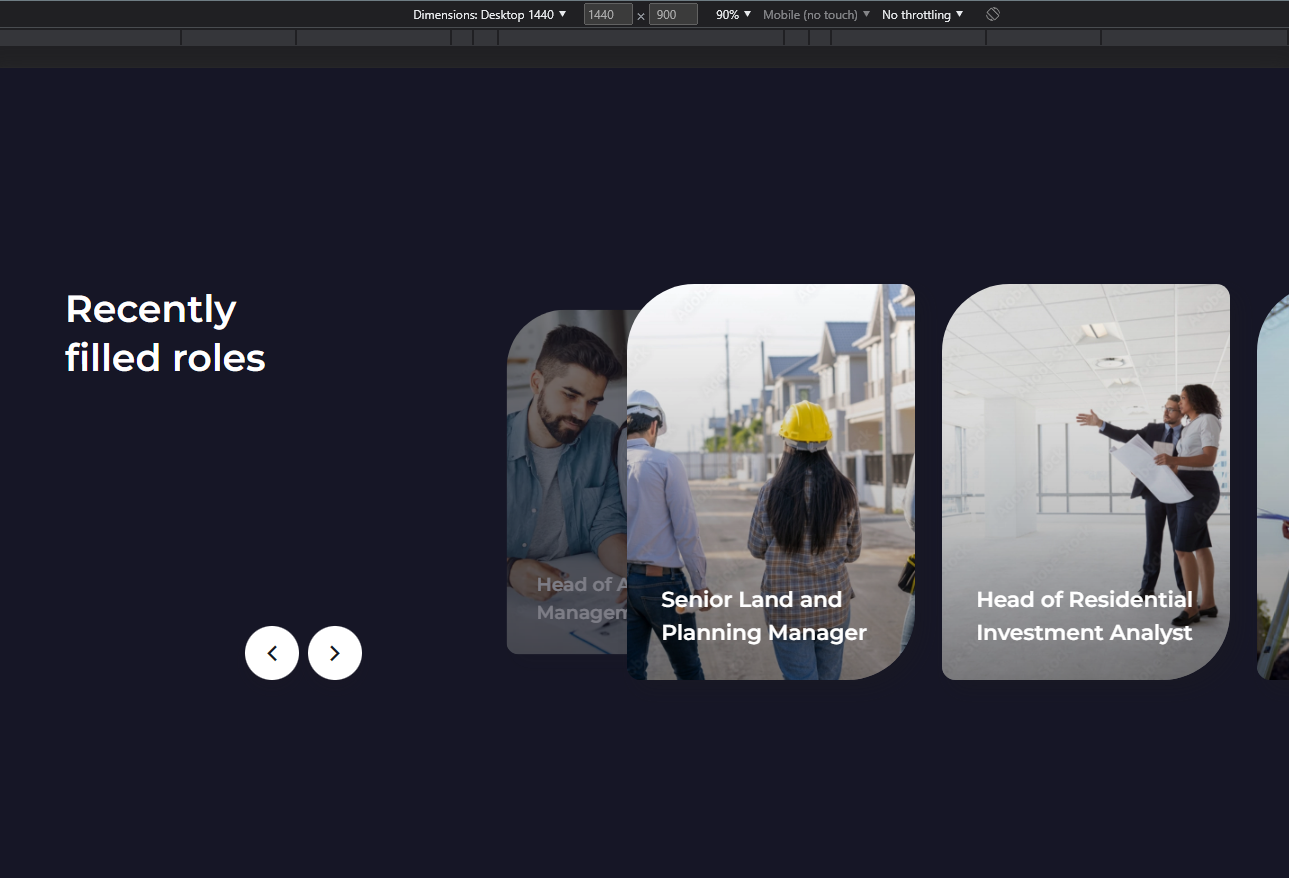
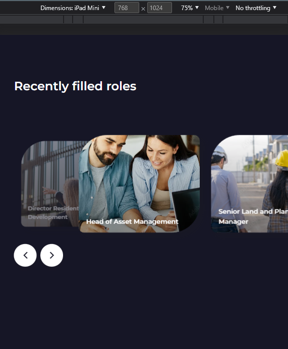
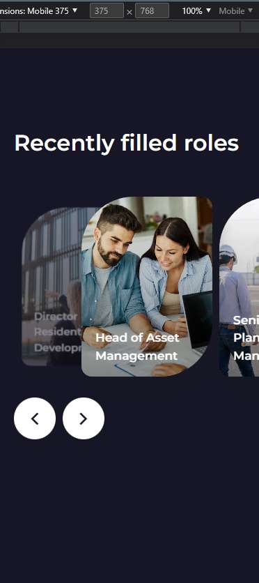
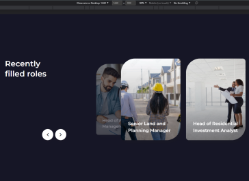
<h2 class="roles-section__title">
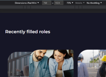
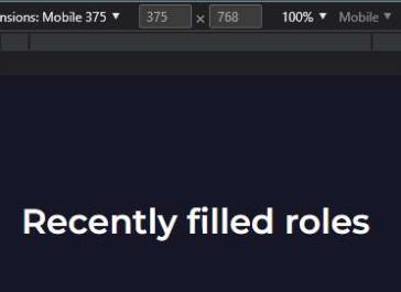
Recently
filled roles
</h2>
<div class="swiper-navigation flex items-center space-x-[10px]">
<div class="swiper-btn-prev">
<i class="icon-arrow-prev"></i>
</div>
<div class="swiper-btn-next">
<i class="icon-arrow-next"></i>
</div>
</div>
</div>
<div class="slider-container">
<div class="swiper roles-swiper overflow-visible">
<div class="swiper-wrapper">
<div class="role-card swiper-slide">
<div class="role-card__bg">
<picture>
<source data-srcset="./images/roles/role-1.webp" type="image/webp">
<img class="lazyload" data-src="./images/roles/role-1.jpg" alt="">
</picture>
</div>
<h3 class="role-card__title">Director Residential Development</h3>
</div>
<div class="role-card swiper-slide">
<div class="role-card__bg">
<picture>
<source data-srcset="./images/roles/role-2.webp" type="image/webp">
<img class="lazyload" data-src="./images/roles/role-2.jpg" alt="">
</picture>
</div>
<h3 class="role-card__title">Head of Asset Management</h3>
</div>
<div class="role-card swiper-slide">
<div class="role-card__bg">
<picture>
<source data-srcset="./images/roles/role-3.webp" type="image/webp">
<img class="lazyload" data-src="./images/roles/role-3.jpg" alt="">
</picture>
</div>
<h3 class="role-card__title">Senior Land and Planning Manager</h3>
</div>
<div class="role-card swiper-slide">
<div class="role-card__bg">
<picture>
<source data-srcset="./images/roles/role-4.webp" type="image/webp">
<img class="lazyload" data-src="./images/roles/role-4.jpg" alt="">
</picture>
</div>
<h3 class="role-card__title">Head of Residential Investment Analyst</h3>
</div>
<div class="role-card swiper-slide">
<div class="role-card__bg">
<picture>
<source data-srcset="./images/roles/role-6.webp" type="image/webp">
<img class="lazyload" data-src="./images/roles/role-6.jpg" alt="">
</picture>
</div>
<h3 class="role-card__title">Head of Construction</h3>
</div>
</div>
</div>
</div>
</div>
</div>
</section>
                            .cont {
  margin: 0 auto;
  max-width: 1280px;
  width: perc(1280);

  @include media(901) {
    width: 89%;
  }
}

.roles-section {
  padding: 173px 0 ac(209px, 218px);
  z-index: 10;
  margin-top: 67px;

  &__wrap {
    display: flex;

    @include media(769) {
      flex-direction: column;
    }
  }

  &__heading {
    padding-right: 70px;
    position: relative;
    margin-right: 140px;
    z-index: 5;

    .swiper-navigation {
      position: absolute;
      right: 0;
      bottom: 0;
    }

    @include media(1025) {
      margin-right: 70px;
    }

    @include media(991) {
      padding-right: 0;
    }

    @include max-md {
      margin-right: 0;
      margin-bottom: ac(95px, 42px, 375, 769);
      position: static;

      .roles-section__title {
        max-width: 100%;
      }

      .swiper-navigation {
        right: auto;
        left: 0;
        bottom: -90px;
      }
    }
  }

  &__title {
    max-width: 260px;
  }

  @include max-md {
    margin-top: 0;
    padding-top: 115px;

    .cont {
      position: relative;
    }
  }
}

.role-card {
  max-width: 320px;
  padding: 0 ac(35px, 10px) ac(35px, 17px) ac(38px, 20px);
  display: flex;
  align-items: flex-end;
  position: relative;
  border-radius: 75px 15px;
  box-shadow: 10px 10px 20px rgb(28 27 28 / 25%);
  overflow: hidden;
  min-height: ac(440px, 258px);

  &__bg {
    position: absolute;
    width: 100%;
    height: 100%;
    left: 0;
    top: 0;
    z-index: -1;

    img {
      position: relative;
      width: 100%;
      height: 100%;
      object-fit: cover;
    }

    &:before {
      content: '';
      position: absolute;
      width: 100%;
      height: 100%;
      left: 0;
      top: 0;
      z-index: 2;
      background: linear-gradient(180deg, #00000000 0%, #00000067 100%);
    }
  }

  &__title {
    color: var(--white);
    font-size: ac(24px, 17px);
  }

  @include media(415) {
    max-width: 188px;
  }
}

.slider-container {
  position: relative;
  display: flex;

  .roles-swiper {
    max-width: 100%;
    width: 320px;
    margin-left: 0;

    @include media(551) {
      width: 188px;
    }
  }

  &:before {
    content: '';
    position: absolute;
    left: ac(115px, 75px);
    top: 50%;
    transform: translateY(-50%);
    width: 100vw;
    height: 100%;
    min-height: 651px;
    background-color: var(--beige);
    border-radius: 125px 0 0 25px;

    @include media(991) {
      min-height: 420px;
      transform: none;
      top: -45px;
    }
  }
}

.swiper-btn-prev,
.swiper-btn-next {
  border-radius: 50%;
  width: 60px;
  height: 60px;
  background: var(--white);
  color: var(--black);
  font-size: 18px;

  display: flex;
  align-items: center;
  justify-content: center;
  box-shadow: 0 10px 15px rgb(28 27 28 / 16%);
  border: 1px solid transparent;
  @include transition-all();

  i {
    transition: color 0.3s ease;
  }

  &:hover:not(.swiper-button-disabled) {
    background: transparent;
    border-color: var(--white);

    i {
      color: var(--white);
    }
  }

  &.swiper-button-disabled {
    opacity: 0.5;
    cursor: auto;
  }
}
                            .cont {
    margin: 0 auto;
    max-width: 1280px;
    width: perc(1280);

    @mixin media 901 {
        width: 89%;
    }
}

.roles-section {
    padding: 173px 0 ac(209px, 218px);
    z-index: 10;
    margin-top: 67px;

    &__wrap {
        display: flex;

        @mixin media 769 {
            flex-direction: column;
        }
    }

    &__heading {
        padding-right: 70px;
        position: relative;
        margin-right: 140px;
        z-index: 5;

        .swiper-navigation {
            position: absolute;
            right: 0;
            bottom: 0;
        }

        @mixin media 1025 {
            margin-right: 70px;
        }

        @mixin media 991 {
            padding-right: 0;
        }

        @mixin tab-sm {
            margin-right: 0;
            margin-bottom: ac(95px, 42px, 375, 769);
            position: static;

            .roles-section__title {
                max-width: 100%;
            }

            .swiper-navigation {
                right: auto;
                left: 0;
                bottom: -90px;
            }
        }
    }

    &__title {
        max-width: 260px;
    }

    @mixin tab-sm {
        margin-top: 0;
        padding-top: 115px;

        .cont {
            position: relative;
        }
    }
}

.role-card {
    max-width: 320px;
    padding: 0 ac(35px, 10px) ac(35px, 17px) ac(38px, 20px);
    display: flex;
    align-items: flex-end;
    position: relative;
    border-radius: 75px 15px;
    box-shadow: 10px 10px 20px rgb(28 27 28 / 25%);
    overflow: hidden;
    min-height: ac(440px, 258px);

    &__bg {
        position: absolute;
        width: 100%;
        height: 100%;
        left: 0;
        top: 0;
        z-index: -1;

        img {
            position: relative;
            size: 100%;
            object-fit: cover;
        }

        &:before {
            content: '';
            position: absolute;
            width: 100%;
            height: 100%;
            left: 0;
            top: 0;
            z-index: 2;
            background: linear-gradient(180deg, #00000000 0%, #00000067 100%);
        }
    }

    &__title {
        color: var(--white);
        font-size: ac(24px, 17px);
    }

    @mixin media 415 {
        max-width: 188px;
    }
}

.slider-container {
    position: relative;
    display: flex;

    .roles-swiper {
        max-width: 100%;
        width: 320px;
        margin-left: 0;

        @mixin mob-lg {
            width: 188px;
        }
    }

    &:before {
        content: '';
        position: absolute;
        left: ac(115px, 75px);
        top: 50%;
        transform: translateY(-50%);
        width: 100vw;
        height: 100%;
        min-height: 651px;
        background-color: var(--beige);
        border-radius: 125px 0 0 25px;

        @mixin media 991 {
            min-height: 420px;
            transform: none;
            top: -45px;
        }
    }
}

.swiper-btn-prev,
.swiper-btn-next {
    border-radius: 50%;
    size: 60px;
    background: var(--white);
    color: var(--black);
    font-size: 18px;

    display: flex;
    align-items: center;
    justify-content: center;
    box-shadow: 0 10px 15px rgb(28 27 28 / 16%);
    transition: setTransition(background, opacity);
    border: 1px solid transparent;

    i {
        transition: setTransition(color);
    }

    &:hover:not(.swiper-button-disabled) {
        background: transparent;
        border-color: var(--white);

        i {
            color: var(--white);
        }
    }

    &.swiper-button-disabled {
        opacity: 0.5;
        cursor: auto;
    }
}
                            const rolesSection = document.querySelector(".roles-section");
if (rolesSection) {
  const rolesSlider = new Swiper(".roles-swiper", {
    slidesPerView: 1,
    spaceBetween: 10,
    speed: 600,
    grabCursor: true,

    effect: "creative",
    creativeEffect: {
      limitProgress: 8,
      prev: {
        translate: [0, 0, -320],
        opacity: 0,
      },
      next: {
        translate: ["calc(100% + 10px)", 0, 0],
        opacity: 1,
      },
    },

    // Autoplay
    autoplay: {
      delay: 3500,
      disableOnInteraction: false,
      pauseOnMouseEnter: true,
    },

    // Navigation
    navigation: {
      nextEl: ".roles-section .swiper-btn-next",
      prevEl: ".roles-section .swiper-btn-prev",
    },

    breakpoints: {
      550: {
        spaceBetween: 30,

        creativeEffect: {
          limitProgress: 8,
          prev: {
            translate: [0, 0, -320],
            opacity: 0,
          },
          next: {
            translate: ["calc(100% + 30px)", 0, 0],
            opacity: 1,
          },
        },
      }
    }
  });

  SafariSwiper(rolesSlider)
}
Для правильної роботи необхідно замінити декілька налаштувань у властивості creativeEffect:
1. Треба замінити 3-є значення властивості translate у об'єкті prev на ширину вашого слайду, в даному прикладі ширина слайду 320px
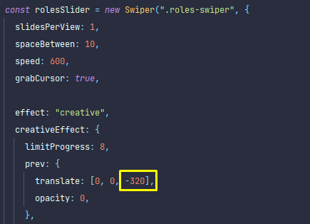
Image
2. Також для того щоб були правильні відступи, значення spaceBetween повинно дорівнювати 1-шому значенню в функції calc() у об'єкті next
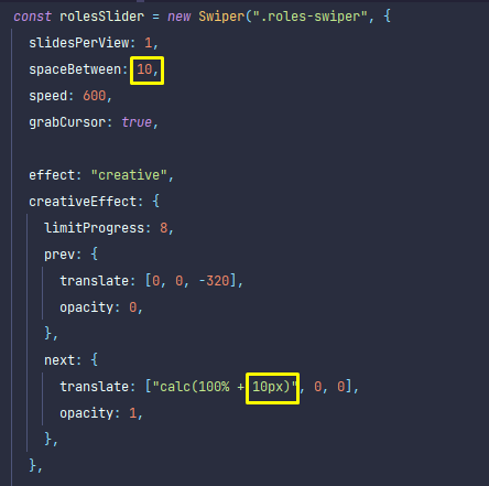
Image